Chimeric Worlding: Graphic Design, Poetics, and Worldbuilding
Chimeric Worlding: Graphic Design, Poetics, and Worldbuilding Tiger Dingsun
Key Words: Poetics, World-Building, Structure, Mythos, Narrative, Ambiguity, Epistemic Disobedience, Non-Teleological Reading.
Introduction
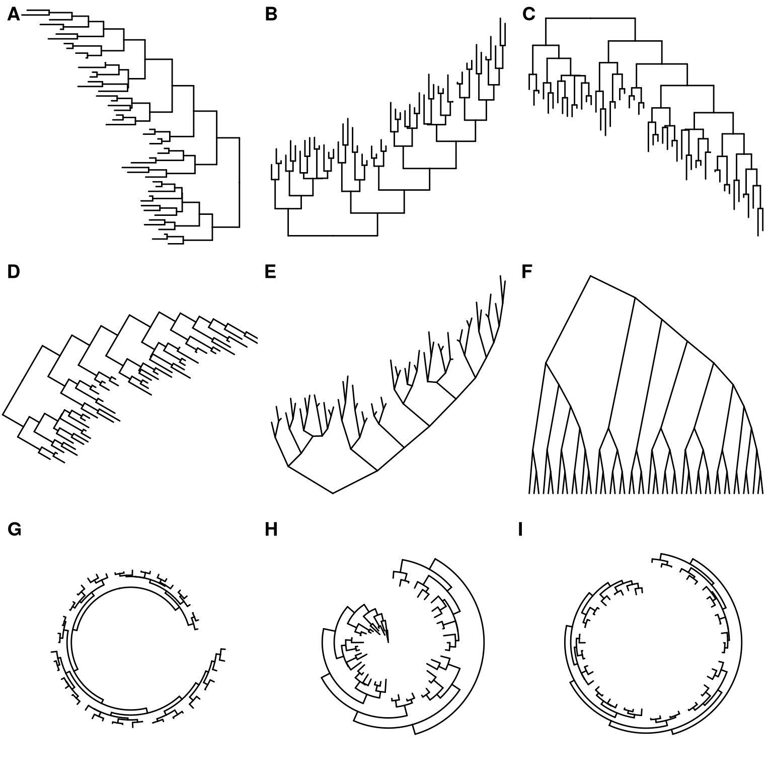
There’s a tendency to place graphic designers in metaphor with other roles – graphic designer as author, as architect, as mercenary, as translator, as curator, as artist. I get it. All of those functions feel so much more archetypally weighty than ‘graphic designer’, which feels so thin and modern. Perhaps we are interested in these re-framings and transformations because there’s an anxiety that comes from feeling like our entire field is stuck between being an artform and a service industry.
But actually, there’s great potential in the label of ‘graphic designer.’ Why not reverse the direction of the analogy? Author as graphic designer, architect as graphic designer, mercenary as graphic designer, etc. etc. Distilled down, graphic design is just the arrangement of visual elements. That feels broad enough to open up the limits of what we typically think of as a graphic design practice. Instead of trying to embody a specific archetype, why not make use of the ambiguity that arises from the thinness and malleability of our field?
There’s not much use in trying to pigeon-hole graphic design into any one particular frame. In fact, I want to introduce two new archetypes into our arsenal of tools: 1) the poet, and 2) the world-builder.
Here’s how I see the two are related:

Worldbuilding involves developing systems of history, culture, politics, magic, lore, knowledge, aesthetics, etc. etc., which form the substrate from which narratives can play out. A useful phrase here might be something like ‘meta-authorship’. An even more useful phrase might just be ‘creating a vibe.’

Poetry involves creating substance — the poems themselves, or whatever unit of poetry one wishes — out of a substrate that is based on the poet’s own personal world of interrelated symbols. ‘Creating something that embodies and implies a larger vibe.’ Reading poetry often involves a degree of opaqueness, but you usually still get a sense of the poet’s inner world.
Can graphic designers do these things too? Be author and meta-author at the same time? My goal is to outline a methodology for graphic designers to think of their practice as worldbuilding, and to consider the potentials and poetics that lie in such an endeavor.
Graphic Design and Poetics
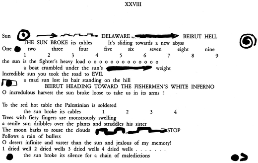
Graphic design is often associated with pure functionalism, as a means to legibility. But there is great potential in developing a sense of poetics within one’s practice. Poetics – defined as how a text’s different elements come together and produce certain effects onto the reader – sounds a lot like what graphic designers already do.
Poetry seeks to make new meaning through novel configurations of elements (words) from an already established system (language). Graphic design, being related to the organization and presentation of information, can also be seen as making meaning through novel configuration of various elements, which are not just limited to language and text, but also might include images, symbolic meaning, and visual culture writ large. Poetry, more so than other literatures, is concerned not only with the denotative meaning of words, but also the meaning that arises from the aesthetic quality of words (things like phonaesthetics, sound symbolism, rhyme, meter). In dealing with typography, graphic designers are also interested in both the denotative meaning and aesthetic qualities of a text they are working with. Both have a playful relationship to structure, sometimes adhering to, and sometimes breaking, form.
However, one difference between a graphic designer’s and a poet’s oeuvre is that with each poem, insight is gained into the poet’s symbolic world (semiosphere). Each poem provides additional context for the greater body of work by adding to the mythos of the interiority of the poet. In contrast, it’s not so often that each poster that a graphic designer creates relates to some larger world or story. Often the graphic designer’s interiority is purposefully veiled in order to not distract from the ‘actual’ content of the poster.
But it’s extremely worthwhile for graphic designers to approach worldbuilding, because worldbuilding allows for the potential for narratives to sprawl out nonlinearly. It invites a non-teleological reading (reading without a prescribed goal) of the text, (or image, or whatever the object of graphic design is). Designing for multiple layers of meaning offers a point of resistance against graphic design’s primary function as lubricant for the smooth flow of capital (be it economic, social, or otherwise), which relies on a singular, totalizing interpretation of the work/world.
A Methodology for Worldbuilding
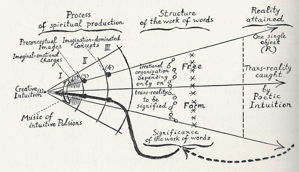
Here’s another framing of poetics and its motivations:
The goal of poetry is to produce an artifact – the poem – that is a middle ground in which the reader gains at least partial access to the interiority of the poet. A world that the reader is invited to co-inhabit. To create a middle ground, a poet has to reconcile both external signifiers (shared archetypes, shared language, shared cultural references) and internal signifiers (symbols and images, and relations that are specifically meaningful to the poet). The poetics lies in developing the relations between all of these signifiers.
A poem that just contains external signifiers might feel impersonal, too literal, and too easily understood, and a poem that just contains internal signifiers might be so specific that it is unintelligible to the reader. By combining signifiers that already familiar to their audience with more personal narratives, images, and symbols, the poet creates entry points into the more untranslatable parts of their psyche. This is related to what the artist Ian Cheng calls ‘worlding’. Cheng writes on his website,
He further writes in another blog post:
Cheng’s description of worlding highlights the interplay between constraints and possibilities. Through meaningful constraints comes infinite possibilities. Poets constrain their work using various structures or self-imposed logics, but also build upon and selectively break apart those structures by incorporating their own idiosyncratic use of language. Through offering both references to (perhaps multiple) systems of shared references and collective knowledge and one's own personal frameworks, poets create new worlds from this combination of different shared frameworks for interpreting reality and the poets own personal reality, worlds that the audience is able to semi-inhabit, and explore over time.
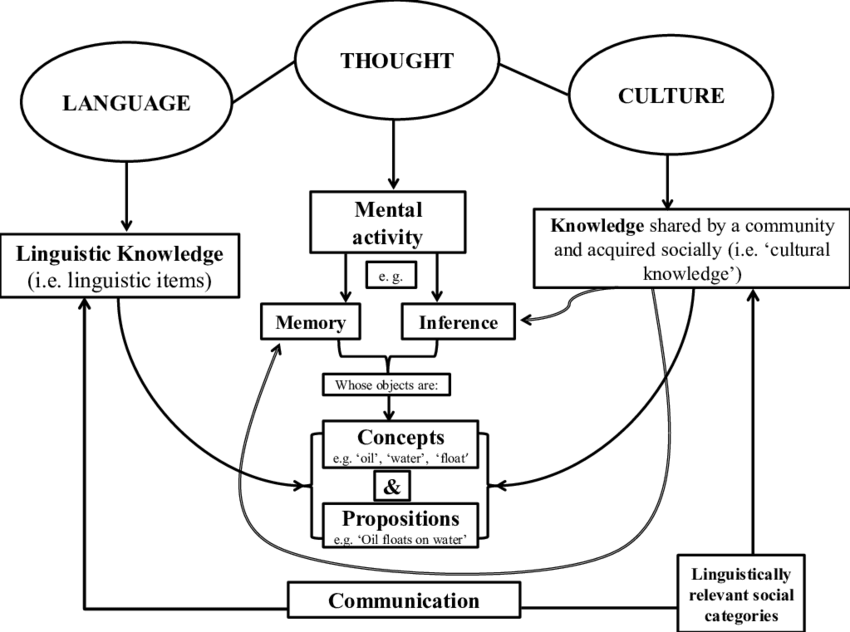
This suggests a methodology that might be of use to graphic designers. Graphic designers can develop their own visual language in the same way that a poet might develop poetic frameworks through which to interpret reality, by fitting together multiple external and internal systems of meaning. Graphic designers are already adept at invoking widely shared, conventional systems of meaning in order to make our work function on the basis of clarity. But it is also possible for clarity to exist simultaneously with another, murkier kind of effect that comes from fortifying conventional logics of hierarchy, scale, and alignment with a graphic designer’s own internal logic and systems of meaning.
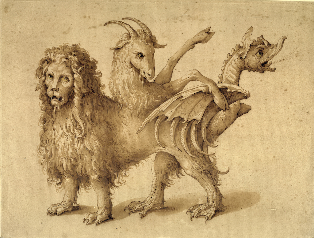
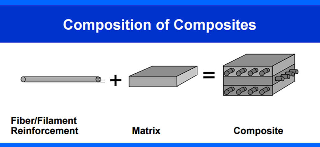
I might call this methodology 'chimeric worlding', to emphasize the fact that these worlds, which graphic designers and their audience cohabitate through their work, are cobbled together from the DNA of various other worlds, and are richer because of this multiplicity. And I choose this word 'chimeric' not only for its meaning in the biological sense, i.e.,
but also for its more metaphorical sense:
Under the methodology of 'chimeric worlding,' there is a call for epistemic disobedience, as the decolonial theorist Walter Mignolo calls it, for we all operate under symbolic systems of oppression. As graphic designers we have the ability to take those pervasive systems and strip them for parts, combining them with other, more marginalized knowledge. Something I’ve noticed about graphic designers (including myself) is that we are deeply invested in the vernacular. We love sifting through archives, not just libraries of objects and images of historical aesthetic traditions, but also the huge piles of pop culture, memes, forgotten digital artifacts, consumer products, etc, etc. We can take what has been deemed ‘low culture’ – perhaps given labels like ‘esoterica’, ‘pop’, or ‘folk’, and give them equal importance with the more conventional historical design references. So much of what is considered ‘good’ or ‘correct’ or ‘legible’ design comes from naturalized conventions of visual hierarchy and structure. Part of this methodology of 'chimeric worlding' involves the possibility of co-opting the aesthetics of structuralism, while recognizing it’s inherent arbitrariness. Common graphic design methodologies assert that every element needs to be there for a non-arbitrary reason, but what if the reason for a graphic design decision has less to do with legibility, and more to do with the greater worldbuilding that the graphic designer has already established? Arbitrariness is in fact emancipatory, and enables us to layer multiple logics and systems of knowledge.
Folklore and Speculative Fiction
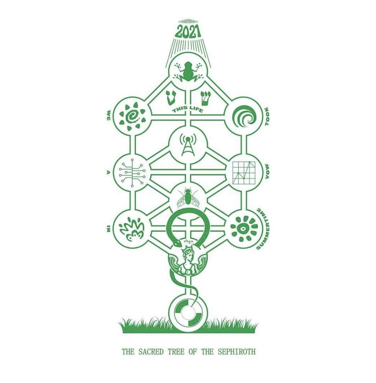
'Chimeric worlding' invites designers to create a cosmology for their work. There’s a relationship here to sacred geometry, to numerology, to mythos. Think of all the pre-modern frameworks that exist for graphically organizing the universe and all that it contains, and how it all functions. Think of the difference between the periodic table of elements and the classical elements of fire, earth, air, and water. Both worldviews imply their own associations, symbolic meanings, and spatial configurations, and conceptual relations. While only one of these systems remains canonical to modern scientific, both offer conceptual relations that might be useful to the designer-as-poet-as-worldbuilder. There’s an opportunity here to do comparative mythology, to mine the history and culture of various aesthetic frameworks as inspiration for organizing content, and for developing one’s own individualized visual language.
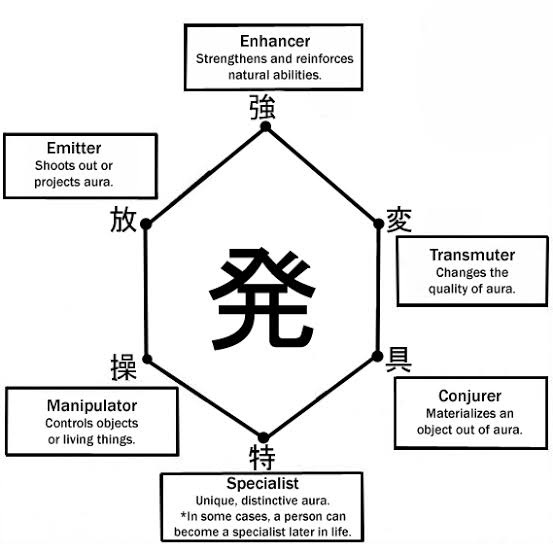
Sci-fi and fantasy writers, have been doing this sort of thing for a while now, adapting various frameworks of knowledge to create new worlds. Another genre that employs worldbuilding, that the idea of 'chimeric worlding' also definitely owes a lot to, is magical realism. I’m especially thinking of the way that magical realism often operates through epistemic disobedience, by presenting to the reader a ‘realistic’ world that then gets disrupted.
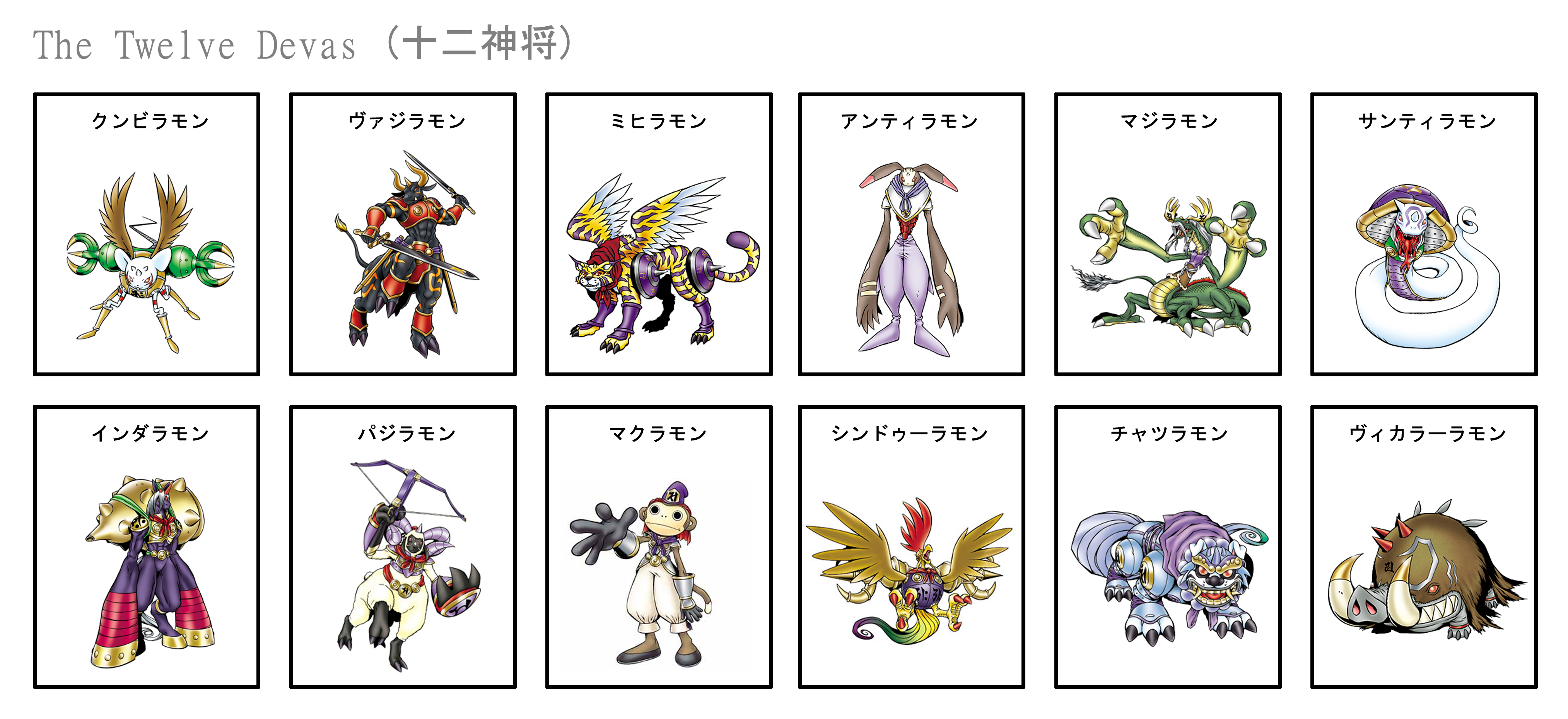
More literally, this relationship between fictional worlds and ‘the real world’ is evident in the fact that much of fictional worldbuilding heavily references various world mythologies, folktales and religions (everything from Thor in the Marvel Cinematic Universe to vampires and werewolves in the Twilight franchise), but in a way that flattens it and makes it more malleable. It’s like secularized mysticism, which might feel a tad blasphemous, but at the same time I don’t think there’s any stopping culture’s appetite for the recombination of meaning.
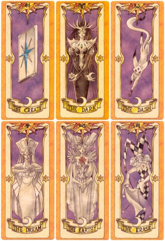
Any existing taxonomy has the potential to be remixed and incorporated into worldbuilding. For example, elemental systems (like in Pokemon, or Naruto, or Avatar: the Last Airbender) originate from any number of different theories of the atomic makeup of matter (the four classical elements of fire, water, earth, air, the 5 elemental system in East Asia of fire, water, earth, metal, wood). The taxonomic system in Digimon comes from a more recent, technological framework of relationships between data, viruses, and vaccines. In Full Metal Alchemist, which establishes a magic system based on multiple historical-cultural definitions of alchemy, the antagonists are organized around the seven deadly sins from Christian philosophy. Other examples include references to tarot cards (Cardcaptor Sakura, Persona 4, Shin Megami Tensei), chakras (Naruto), different musical genres (Trolls World Tour), taxonomies of virtues, personality traits, or emotions (Digimon again, and even the Pixar movie Inside Out), divisions of labor in a dystopian imagining of society (Hunger Games, plus a slew of other YA dystopian series) or different theories of the relationship between mind, body, and soul (too many to count).
There are all of these ways that writers expand a world through its lore, and the great thing about lore is that it implies even more lore, that just hasn’t been made explicit to the audience yet, and is open to speculation. This is the kind of thing that fuels fandom. What if graphic designers could create work capable of garnering fan theories, multiple interpretations, and wild reimaginings? It would mean a depth of engagement with graphic design beyond the singular goal of clarity and communication.
Expanding the Limits of Graphic Design
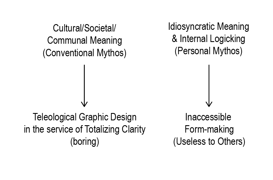
If Graphic Designers only rely on a set of conventions and references that are legible to the dominant culture, then they will inevitably just create things that are meant to be consumed as efficiently as possible, and nothing else. On the flipside, if designers only relied on a personal set of symbols and signifiers that are only meaningful to them, their work will be completely useless to others. The field of graphic design is oriented towards the public, and therein lies its strength. But it can be easy to forget that a public is made of individuals, and it can be hard to create things with entry points to open up individual interpretation by the audience. If the graphic designer develops a rich, hybridized, internal logic through which their body of work functions, even without explicitly explaining that logic, then the audience will be able to slowly piece that together, and to excavate the lore of the world that is created. Poetry and speculative fiction already do this. Graphic designers can, too.
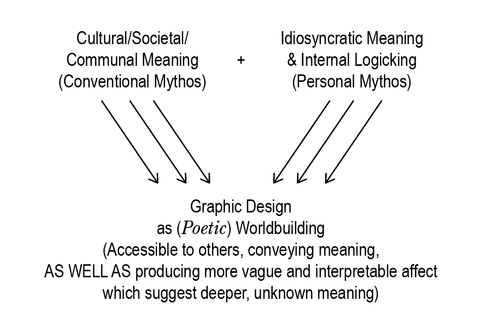
It bears clarifying that this methodology is not one that tells you to throw away all structure, to throw away all of your legacy Western European Graphic Design education and sensibilities. Instead, ‘chimeric worlding’ is a methodology that tells you to provincialize that education, to appropriate and reconfigure it as parts of new hybrids, and to consider it just one tool out of many possible tools, one structure out of many possible structures. This methodology is not one that is anti-structure. It is pro- multivarious and contradictory and ambiguous and poetic structures.
As an analogy, I might say that this methodology is not one that says to make and then ultimately break the grid. Because the truth is, I, and most other graphic designers, like grids. So instead of breaking the grid, I want to make the grid my own, to claim its aesthetics for myself, and to imbue the grid itself with rich layers of connotative meaning and custom logic. The 'chimeric worlding’ version of a grid is both spatial and symbolic. It is a grid that binds itself to the texts and images that lay on top of it, wrapping around it and becoming the bones of a world. And the audience doesn’t necessarily have to understand it all. Is graphic design art? Is it a tool? Neither? Both and more? Within graphic design, the paradox need not be resolved. Clarity can co-exist with poetic ambiguity and the openness of interpretation. Legibility can co-exist with illegibility. Ambiguous structure (or perhaps structural ambiguity?) signals to the audience that there is a world here, and that it is worth engaging with. Even if they can only catch a glimpse at first, they know that there are surely hidden depths to discover.
Further Reading
- Against Worldbuilding — Nick James Scavo
- Notes Toward a Critical Approach to Worlds and World-Building – Stefan Ekman and Audrey Isabel Taylor
- What is a World? – Ian Cheng
- Man and His Symbols – Carl Jung
- An Analysis of Hunter x Hunter's Magic System – u/ComradePruski
- Network – Nicolas Jaar, Jena Myung, and Maziyar Pahlevan
- The Practice of Everyday Life – Michel de Certeau
- Dictee – Theresa Hak Kyung Cha
- The Arab Apocalypse – Etel Adnan
- Minuet-Operas – Frédéric Forte
Exercises
Design exercises that illustrate various ways this methodology of Chimeric Worlding can be applied
- Create your own library of personal symbols. assign each symbol with its own associated color, temperament, element, ruling planet, scent, musical genre, species of flower, etc. Which symbols are weak against other symbols? which symbols harmonize and strengthen each other? which symbols negate each other? which symbols dominate over others?
- Overlay multiple systems of knowledge, classification, and taxonomic schemes that govern your world or are most relevant to you. See how they interact. (For example, map the 5 elements in Chinese philosophy, then overlay a soil classification chart over it, then map it all onto a political compass).
- Numbers are archetypal and often have many levels of significance. Ex:
Choose a number and think of as many taxonomies that come in that number. Visually map them all together.
1: unity and wholeness
2: duality, binaries, dialectics
3: balance, trinities - [ego, id, superego], [father, son, holy spirit]
4: stability, order, materiality, universality, four elements, four corners, four humours
5: five platonic solids, five fingers,five senses,five elements, quintessence
6: perfection, six days of creation, six strings on a guitar
7: luck, seven virtues, seven deadly sins, seven days a week, seven treasures of buddhism
- Describe and map out your own imagined system of gender. Then gender all of the objects in your room with this new system, and visually represent them.
- Arrange your next poster based on sacred geometries, either pulled from historical/cultural references or created by you.
- Create your own magic system, as if you were a sci-fi or fantasy writer, but then represent it all visually. There are writing worksheets available online to help you get started.
- Make a list of your favorite words or phrases, and then map/graph out how all of those words relate to each other. Make oppositions and alliances. Experiment with how these words would map onto other, existing structures. (Ex: which words are phlegmatic, which are choleric, melancholic, and sanguine? Or, which words would you associate with each tarot card in the major arcana? Or, map the words onto a chart that classifies fragrances: which words smell floral to you? which smell woody? which are musky? Or, which words are birds? which are reptiles? which are mammals? which are bugs? which are mushrooms?)
- Draw a symbol, icon, or character, or letterform inspired by each element in some taxonomy (for example: draw a character or symbol or even make an entire poster for each domain of the 9 muses in greek mythology: epic poetry, history, love poetry, music, tragedy, hymns, dance, comedy, and astronomy).
- Find any number of existing graphs, charts, and diagrams. Remove all the text and relabel everything.
- Collect found words or phrases (can come from anywhere — snippets of dialogue, text messages, lines from poems). Use them as the captions for images. Be mindful of the connections you are making. Arrange these images (and their captions) hierarchically/systematically somehow, onto a poster or publication or website (or some other format?)
- Come up with your microgenre. Coin your own -punk, -wave or -core. Imagine the world that this microgenre describes. Flesh out a graphic language for this world.
- Draw a custom symbol, icon, illustration, or logotype for the title of every song on your favorite album.
- Create a character and insert them somehow into everything you make for the next month. Over time, give them some friends. Build out their world.